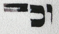
Last time, I said this sort of thing is caused when the ink channel gap is large and the inkflow light.
 Sometimes it's just that the pen is taking a while to get going. So when your quill is doing this, the first thing is not to panic. Don't (I see this a lot) start dabbing frantically at your parchment with those little, fast, darty strokes beloved of certain kinds of artists. This sort of calligraphy needs to be slow and controlled. If you calmly keep going, or just try again, often enough it'll sort itself out. You can see in the image here that it got going after a couple of millimetres, and all I needed to do was go back over the beginning bit.
(You can also see that the letters are Not Very Even.)
A lot of people seem to think that if you don't get it perfect first time, that's that. Give up, move on. Not so - if it comes out like this, you just go over it until it's right.
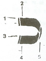
 The sulks can often be dispelled by making a tiny vertical stroke before embarking on the horizontal line. The image at left is a suggested stroke order for writing letter khaf (scanned from Likut Sifrei Stam, the scribes' handbook), and you can see how each horizontal stroke is started with a tiny vertical stroke.
 You barely even need to move the quill, really, but if you do, you get a nifty little twiddle (note technical language). This is another example of necessity becoming a feature of writing - quill writing is easier if you start strokes with tiny vertical lines, and they look rather good (see right), so the little vertical lines become part of the style.
Sometimes it's just that you're running out of ink. Dip in the ink, and all is well. But try the above first; more often the problem is the quill sulking.


No comments:
Post a Comment