
There's still chance for human error though - misspeaking, mishearing, losing the place, saying “hang on a minute" when marking an error and needing to re-establish the place afterwards, going too fast and missing bits, going too slow and wasting time. Plus, it still takes a long time, and paying someone to sit there and read letters is expensive.
This is why I had a friend write me a program which plays the part of the Reader. He called it the scribomatic, which I find vastly pleasing. I have the Torah text in my computer; I copy and paste in the portion of text I want to check, and the scribomatic reads the letters one by one.
Now all I have to do is pick the letter out of the air, not find it in the tikkun, I'm only using a little bit of brain on “Is it there?" and I have lots of brain left over for “Is it kosher?" which means I can assess that more efficiently. When I want the next letter, I press space and the scribomatic reads me the next letter. Pressing space is much quicker than saying “Okay" to the reader and waiting for them to register that and read the next letter.
So the scribomatic uses a computer to do some of the reading and communicating previously done by a human, which reduces the chance of human error. Interacting with the scribomatic is easier and faster than interacting with a human, which makes the process faster. I don't have to fit into its schedule, and I don't have to pay it for its time.
Wednesday, December 30, 2009
Tuesday, December 29, 2009
Proofreading, part 15
Broadening our scope back into the general activity of proofreading, we left off with me saying that one person checking the Torah by reference to a tikkun isn't terribly efficient, for several reasons. This is why tradition developed an alternative process, in which a Reader has the tikkun and a Sofer has the klaf. The Reader reads the letters from the tikkun one by one, and the Sofer checks them off.
This greatly reduces the chance of errors caused by misremembering. It also greatly reduces the amount of time spent moving one's gaze between the klaf and the tikkun, finding and refinding the place, stretching your neck up and down - considered over the length of the entire Torah, this is a considerable saving.
Further, the chance of erring by anticipating - seeing what you think should be there rather than what is there - is reduced, since the text is now being handled as a string of individual letters, rather than as words. To reduce it even further, some people read the text backwards, so it really does become just a string of letters, with no room for anticipation at all.
Monday, December 28, 2009
Proofreading, part 14
Proofreading also picks up on things which are technically kosher and wouldn't make the reader confused, but just aren't very pretty.
This stage is a tricky one, because there's always, always going to be stuff you could have done better, and if you're not careful you'll drive yourself into a frenzy of ever more microscopic tweaking, far beyond the point where it could possibly make a difference. Balancing artistic integrity and realism is a skill that has application beyond Torah proofreading, though, so it's a good skill to learn regardless.
Here's an example. That mem could be prettier.
This is a level of detail I think you can only apply to yourself or your student. Applying it to someone else's writing is just wrong on so many levels – pragmatically idiotic and technically unrealistic, as well as being an exercise in fantastic subjectivity, hyper-criticism, and wishful thinking.
For instance, if you have a Torah that's getting on in years, some of its letters are not going to be as pretty as they once were. Fact of life. You could spend months going over it and restoring each letter to perfection, but like any invasive cosmetic procedure, there's only so much that's going to help; at some point it's better to accept it as is.
But this is a new Torah and I wrote it, so if I want to make that mem prettier, I will.
Sunday, December 27, 2009
Proofreading, part 13
The astute will have worked out by now that this Torah has advanced into the proofreading stage, writing and proofreading happening simultaneously. I just thought I'd mention that.
Proofreading, part 13
The astute will have worked out by now that this Torah has advanced into the proofreading stage, writing and proofreading happening simultaneously. I just thought I'd mention that.
Saturday, December 26, 2009
Proofreading, part 12
As a keen Torah reader myself, I'm well aware of those horrible moments when you're reading along and you look at the Torah and you think “huh? what on EARTH is that?!” When I'm proofreading, I try to pick up on that sort of thing.
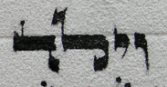
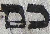
Here's an example. That mem and nun are a bit too close together for comfort, in my opinion.
The letters aren't actually touching each other, so they are kosher as they stand, but they're close enough that they'd make me, as a reader, stop and look more closely. Well, I don't like that when I'm reading, and I'm a huge fan of “What is hateful to you, do not do unto others,” so when I'm proofreading I try to fix that sort of thing, even if technically it doesn't need to be fixed.
Friday, December 25, 2009
Proofreading, part 11
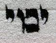
Pasul letter mem
Proofreading has to pick up on letters which have real problems in their form. Maybe the scribe's hand slipped, maybe the letter got smudged by accident, maybe the ink spread after being put on – letters can go wrong, and we don't always notice while we're writing. So proofreading has to be alert for that kind of thing.
Again, you need knowledge of letter forms. You need to know why the above is a problem.
The problem is this little join. Such a little thing, but so important.
I like thinking of it as being similar to electricity. Electricity doesn't care if it's only a little tiny wire making the short-circuit; that little tiny wire short-circuits your thing and boom, it isn't working any more. Same with letters. This mem is short-circuited, and it doesn't work any more.
And like the more annoying kind of short-circuit, you can't just take out the offending part and have everything work, no, you have to take the thing apart and rebuild it.
(Super-geekies can read chapter 8, paragraph 6 of the Keset ha-Sofer for info on how to fix a short-circuited mem, but the non-super-geeky may prefer to give it a miss.)
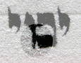
Couple more examples, for your delectation. One's a shin with a short-circuit, the other is supposed to be a yud followed by a nun, but the short-circuit there has turned it into a tzaddi. Internet cookies for anyone who explains how to fix them.
Thursday, December 24, 2009
Proofreading, part 10
We saw an example of one sort of thing which proofreading turns up – where the text is Just Wrong:
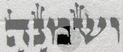
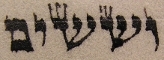
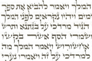
Text should read שמנה מאת שנה.
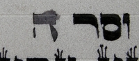
That was a case where the extra letter vav completely changed the meaning - “eight hundred" became “one hundred and eight." But in some cases, an extra or missing yud or vav doesn't actually change the meaning, thanks to the accommodating nature of Hebrew vowels. These are known as haser (deficient) or malei (overblown) spellings. Like this:
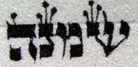
This is a word spelled haser - lacking a vav - where it should be spelled with a vav, ויולד.
If you're reading in the Torah and you find the first kind of Wrong, it's a problem, and you have to stop and switch Torahs. But if you find the second sort, you don't have to switch Torahs. The mistake ought to be fixed soon, because thinking "oh, it doesn't matter" is the first step on the road to propagating mistakes which jolly well do matter, but you don't have to stop reading.
This has to do with the extent to which we think the text of the Torah is incorruptible. I simplified a bit earlier – the integrity of the text is a theological principle except for these kinds of spellings. These ones we're not exactly certain of, and haven't been since Talmudic times.
So we weigh values. Stopping and switching out Torahs is not good, for various reasons; reading from a Torah with wrong spelling is not good either. With very egregious misspellings, the badness of the mistake outweighs the badness of switching Torahs. But haser and malei misspellings, since we're not absolutely certain they're actually wrong, there's a chance our spelling could be the right one, and on the strength of that chance we swing the balance the other way. Interesting, huh?
Text should read שמנה מאת שנה.
That was a case where the extra letter vav completely changed the meaning - “eight hundred" became “one hundred and eight." But in some cases, an extra or missing yud or vav doesn't actually change the meaning, thanks to the accommodating nature of Hebrew vowels. These are known as haser (deficient) or malei (overblown) spellings. Like this:
This is a word spelled haser - lacking a vav - where it should be spelled with a vav, ויולד.
If you're reading in the Torah and you find the first kind of Wrong, it's a problem, and you have to stop and switch Torahs. But if you find the second sort, you don't have to switch Torahs. The mistake ought to be fixed soon, because thinking "oh, it doesn't matter" is the first step on the road to propagating mistakes which jolly well do matter, but you don't have to stop reading.
This has to do with the extent to which we think the text of the Torah is incorruptible. I simplified a bit earlier – the integrity of the text is a theological principle except for these kinds of spellings. These ones we're not exactly certain of, and haven't been since Talmudic times.
So we weigh values. Stopping and switching out Torahs is not good, for various reasons; reading from a Torah with wrong spelling is not good either. With very egregious misspellings, the badness of the mistake outweighs the badness of switching Torahs. But haser and malei misspellings, since we're not absolutely certain they're actually wrong, there's a chance our spelling could be the right one, and on the strength of that chance we swing the balance the other way. Interesting, huh?
Wednesday, December 23, 2009
Proofreading, part 9
All this place-finding and looking up and down takes time. Only a couple of seconds each time, but that adds up fast, as you can probably imagine.
Holding a string of letters in your mind isn't efficient either, partly just because one can forget things, and partly because of anticipation; when you're reading the text as words, you're much too liable to remember what you think ought to be there rather than what actually is there. That's how most of these mistakes get in there in the first place.
You're also liable to confuse phononyms, liable to skip silent letters, liable to attempt to remember too much and thus forget parts unawares.
And all this is only answering “Is the letter there?". The question of “Is it kosher?" requires more mental processing, as we saw earlier - is it touching another letter, does it have all the parts it needs, does it have the right decoration. The above list doesn't leave much brain left over for processing these questions.
More about how we deal with that later. First, we'll see some other cases where such mental processing is required.
Tuesday, December 22, 2009
Proofreading, part 8
When I'm proofreading my writing for the first time, there are two questions I'm asking regarding each of the 304,805 letters: is the letter there, and is the letter kosher?
The process goes like this.
With a sheet of freshly-written Torah in front of you, you find your place in the tikkun and look at it to see what letters ought to be written.
Carrying those letters in your mind, you look down and find your place on the klaf, and compare the letter string in your mind to the letter string on the klaf.
If they don't match, fix it.
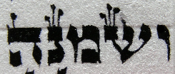
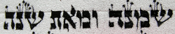
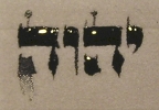
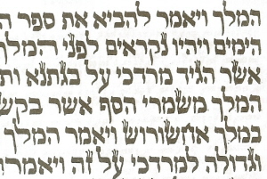
For instance, this is just wrong, but I didn't realise it at the time. It ought to read שמנה מאת שנה.
Then look back up and find your place in the tikkun, and repeat.
The process goes like this.
With a sheet of freshly-written Torah in front of you, you find your place in the tikkun and look at it to see what letters ought to be written.
Carrying those letters in your mind, you look down and find your place on the klaf, and compare the letter string in your mind to the letter string on the klaf.
If they don't match, fix it.
For instance, this is just wrong, but I didn't realise it at the time. It ought to read שמנה מאת שנה.
Then look back up and find your place in the tikkun, and repeat.
Proofreading, part 6a
Gabriel points out, correctly, that some authorities permit erasing of a Divine Name which was created by hak tokhot.
You see why that should be, of course? The logic goes, if the shapes made by hak tokhot don't count as letters, then the Divine-Name-like things created thereby cannot be proper Divine Names, and if they aren't Divine Names, you may erase them.
A coherent position, it's just not one I would generally apply, particularly not in this kind of circumstance. Being able to justify something doesn't mean we should go around doing it.
Monday, December 21, 2009
Proofreading, part 7
Getting back to proofreading proper.
As we've heard, in order to encourage integrity of the text, we have a rule that even one wrong letter invalidates the entire Torah.
When you're writing 304,805 letters, you're bound to slip up on some of them. So, when you write a Torah, you proofread it extremely carefully, more than once, before you release it into the wild, as it were, and read from it.
Here's a place where I was merrily writing along, wrote the wrong letter, and realised it at once. The ink was still wet, so I blotted off as much as I could with kitchen paper, that's why it looks grey and shadowy. Makes the erasing easier.
To fix this sort of thing, you need to let it dry and then scrape off the excess. But letting it dry takes a good fifteen minutes (if you try fixing it sooner you just rub it in and make it worse) and it's inefficient to sit about watching ink dry for a quarter of an hour. If you're writing tefillin or mezuzot, you've got no choice, you've got to fix it before continuing, but when you're writing Torah you can skip over the mistake and come back to fix it later.
Now we're in the proofreading stage, it's "later," and time to fix.
These pale-grey blotted ones are obvious – when you made the mistake, you realised it at the time, you blotted it, perhaps you made a note in pencil in the margin – these aren't difficult to see. The really taxing part comes next.
Sunday, December 20, 2009
Proofreading, part 6
Here's a case where a small child came in handy, though. The final hey in a Divine Name got smudged accidentally, so it sort of looks like an ugly hey and it sort of looks like an ugly kuf. It's definitely one or the other, but which?
Remember you aren't allowed to erase Divine Names or any part thereof. You really, really, really aren't allowed to do it.
If the letter is a hey, the Divine Name is still, as it were, live. The smudgy part would have to stay there, not be erased to make it tidier. If the letter is a hey, we must leave it alone.
If the letter is a kuf, the Divine Name will have been switched off, and we can remove the smudgy part and make it back into a pretty hey. It can't stay as a kuf. If the letter is a kuf, we must erase it.
We need a decision. Which is it? Adult brains see the problem in shades of grey, and become unable to reduce it to the necessary black and white. Young child brains only see things in black and white, so we use their eyes. My friend Hillel's young child told us that the letter was a kuf, so kuf it was.
***Really technical bit coming up***
You have to erase a smudge like this from the top down, not the bottom up. Very important. If you erase from the bottom up, you'll at some point turn the letter back into hey, but by hak tokhot. A letter made by hak tokhot isn't a proper letter from the perspective of Torah reading, but it's definitely a proper letter from the perspective of erasing Divine Names. So if, during your erasing, you make this:
you've got a REAL problem – a hey that isn't valid, but which you can't erase and write validly.
This is one of the reasons soferim have to study lots of halakha; so that they know how to anticipate and avoid pickles like that.
Saturday, December 19, 2009
Proofreading, part 5
Here we have a something that ought to be a yud, but looks an awful lot like a vav. (This isn't DE's Torah, by the way. Just part of my stock of interesting Torah photos.)
This kind of ambiguity can, interestingly, be resolved by showing the ambiguous letter to a small child. Adults are troubled by the shades of grey in the problem, finding the exact point on the continuum between yud and vav where the change of state happens, and therefore can't decide if it's yud or vav; a small child still sees the world in black and white, and will decide one way or the other because it can't see the middle ground between “yes” and “no.”
Small children being in short supply round here, in ordinary Torah proofreading it's usually quicker just to fix the letter (with appropriate care for hak tokhot, of course). I counted this one as a vav, so I erased its whole tail and then put the tail back in but shorter.
Friday, December 18, 2009
Proofreading, part 4
As a proofreader, you have to be rather aware of what you're dealing with. If you come across, say, a yud which looks far too much like a vav for comfort,
like this,
you certainly ought to fix it; everyone agrees that that's no good at all. But if you're proofreading something by a Sephardi scribe, and you find that the shins have flat bottoms, you'd be foolish to go through and change each shin to having a pointy bottom.
It's like American vs British spelling - if you're a Brit (okay, or a Canadian) editing the New York Times and you find words like “plow” and “theater,” you'd be an idiot to impose British spellings and change them to “plough" and “theatre." But if you find a word like “rabibt" whilst editing Watership Down, it's quite appropriate to change it to “rabbit" because “rabibt" is obviously wrong according to absolutely everyone. Is your ambiguity a plow or a rabibt?
The image above, to explain in more detail, has a letter that ought to be a yud, but it's really a bit too long in the tail to be a yud. It's more like a vav. More about that shortly.
Thursday, December 17, 2009
Proofreading, part 3

Sephardi shin

Ashkenazi shin
Shin, for Ashkenazim, has to have a pointy bottom. But Sephardim don't necessarily agree with that, and many Sephardi styles give shin a rounded or flat bottom. Now, most Ashkenazim don't think that this is a deal-breaker; you can still recognise the letter as shin, after all, but a few Ashkenazim do think it's very much a deal-breaker. They may even avoid Torah readings from a Sephardi-style Torah on this basis. Some Sephardi scribes add a nominal point to their shins, as here, for compatability:

This is a formalised example of how minor variation in letter forms can affect how kosher it is - formalised because the variation is accepted as valid by different branches of the tradition. Accidental variation is more likely for the sort of proofreading I'm doing. A more common example, of ambiguity affecting kashrut, follows shortly.
Wednesday, December 16, 2009
Proofreading, part 2
A scribe today has an exhaustive list of rules for how each letter ought to look – here's an example for letter shin, from the Mishnah Berurah:
Specifically, it's interesting that the later authorities - i.e. the ahronim, post-Shulhan-Arukh, more or less - devote a lot of space to defining how the letters should look, but the rishonim and earlier (including the Shulhan Arukh) don't seem too interested in that - they know how the letters ought to look, and they content themselves with reminding you particular ways in which you ought not to stray, like not making alefs ayins and suchlike.
Alef-bets differ with region and period. We've already seen some of the ways Ashkenazic and Sephardic alef-bets differ, when we were discussing influence of writing implement on letter style. We didn't discuss there how those styles relate to the laid-down rules for letter forms.
Letter shin is a case in point. Literally.
Sephardi shin
Ashkenazi shin
More about that later.
Shin has three heads. The first head, with the leg which is drawn out of it, is like a vav, and its face is tilted slightly upwards. The second head is like yud; its head is tilted slightly upwards, and ideally it has a little prickle on it. The third head must be made like zayin, and it has three taggin on it. The left heads of all the letters שעטנז גץ are like zayin. One must take care that the heads do not touch each other. The leg of this left head should lekhathilah be particularly vertical...and it goes on, I won't give you all of it here.
Specifically, it's interesting that the later authorities - i.e. the ahronim, post-Shulhan-Arukh, more or less - devote a lot of space to defining how the letters should look, but the rishonim and earlier (including the Shulhan Arukh) don't seem too interested in that - they know how the letters ought to look, and they content themselves with reminding you particular ways in which you ought not to stray, like not making alefs ayins and suchlike.
Alef-bets differ with region and period. We've already seen some of the ways Ashkenazic and Sephardic alef-bets differ, when we were discussing influence of writing implement on letter style. We didn't discuss there how those styles relate to the laid-down rules for letter forms.
Letter shin is a case in point. Literally.
Sephardi shin
Ashkenazi shin
More about that later.
Tuesday, December 15, 2009
Proofreading, part 1
I've talked a bit about how it's okay to fix mistakes, in most circumstances. This series of posts is going to deal with the finding of said mistakes.
The sages were well aware that when you copy a document, and then copy from the copy, and so on, mistakes are likely to creep in over time. This is why we have a rule that even one mistake in a Torah scroll renders the entire scroll invalid for use until the mistake is fixed - zero-tolerance is really the only policy you can have if you want to ensure that your document will be absolutely unchanged.
This, incidentally, is also why we have the rule about copying from a copy. The scribe simply isn't allowed to write the scroll down from memory - he may have it more or less accurate, but in a culture where each letter has the status of being divinely dictated, even a variation of one letter can't be accepted, and recall from memory might meaan whole words or phrases were a little bit off.
Relatedly, the roles of scribe and editor were pretty much interchangeable throughout much of history, and in most other documents, the occasional variation here and there doesn't matter much, or is even expected (for further reading on this subject, see for instance Scribal Culture and the Making of the Hebrew Bible). But the Torah's integrity was, for rabbinic Judaism, a theological principle, and as such, deviation from the text could not be accepted.
So it is that when you write a Torah, you have to proofread it extremely carefully.
You have to go through the scroll and check that each and every one of the 304,805 letters is there and has its proper form. Ambiguity in form can be a bit of a disaster, since it can turn one word into a completely different word rather easily. More about that later.
Monday, November 30, 2009
Ketivah Tamah
Shabbat 103b/Sifrei Vaethanan
And that ain't the half of it.
וכתבתם - שתהא כתיבה תמה; שלא יכתוב אלפ"ין עיינ"ין, עיינ"ין אלפ"ין, בית"ין כפ"ין, כפ"ין בית"ין, גמ"ין צד"ין, צד"ין גמ"ין, דלת"ין ריש"ין, ריש"ין דלת"ין, היה"ין חית"ין, חית"ין היה"ין, וו"ין יוד"ין, יוד"ין וו"ין, זיינ"ין נונ"ין, נונ"ין זיינ"ין, טית"ין פיפ"ין, פיפ"ין טית"ין, כפופין פשוטין, פשוטים כפופין, מימ"ין סמכ"ין, סמכ"ין מימ"ין, סתומין פתוחין, פתוחין סתומין. פרשה פתוחה לא יעשנה סתומה, סתומה לא יעשנה פתוחה.
When the Torah says "ukhtavtam," it means that it should be ketivah tamah - perfect/simple writing. So you shouldn't make:
alephs into ayins or ayins into alephs.
Nor beits into khafs or khafs into beits.
Nor gimels into tzadis or tzadis into gimels.
Nor dalets into reishes or reishes into dalets.
Nor heys into hets or hets into heys.
Nor vavs into yuds or yuds into vavs.
Nor zayins into nuns or nuns into zayins.
Nor tets into pehs or pehs into tets.
You shouldn't make bent ones straight or straight ones bent
Nor mems into samechs or samechs into mems.
You shouldn't make opens closed or closeds open.
And that ain't the half of it.
Thursday, November 12, 2009
Quills, part 18
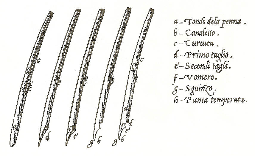
Found this the other day: "Instructions for the cutting of a quill-feather in Ludivico Arrighi's La Operina da Imparare di scriuere littera Cancellarescha printed in Rome in 1522."
Scan from Ada Yardeni's The Book of Hebrew Script.
Yardeni's book, incidentally, is as described: "history, palaeography, script styles, calligraphy & design." Ada Yardeni's a combined paleography-scholar-graphic-designer, so as you might expect, there's a lot of brain food here. My copy is getting rather battered because it's generally the first thing I fish out of the shelf when I have general historical questions about script. It's not intended as a calligraphy source-book, so don't buy it expecting that. Buy it expecting to learn an awful lot about history, palaeography and script styles, with a bit of calligraphy thrown in, and you won't be disappointed.
Wednesday, November 11, 2009
Quills, part 17

When the problem isn't technique or lack of ink, generally it's because the semiquills aren't sufficiently close together. Sometimes that's because you made a muck of cutting the ink channel, and the only thing to be done is start over, but usually it's not so drastic as that.
 Often you notice it first thing in the morning. Overnight, your quill dried out a little, and the semiquills pulled apart a bit.
My scribey chum DMV discovered a way to prevent this: water tubes for flowers. They're little tubes with a rubbery seal on top, designed for sticking single blooms in so that they stay fresh. Of course, a flower stem is pretty much like a quill in the essential details, so you can use them to keep your quills damp, by putting a tiny bit of damp sponge in the bottom. Jolly clever of DMV to spot that, I say.
Tangentially: I like using them for knife storage, too. Much better than having naked blades floating around in your bag, and handier than having to de-blade your knife every time you want to take it somewhere. Like this:

Supposing you didn't manage to prevent semiquill divergence, though. Or perhaps the semiquills have pulled apart not because of drying out but because of rough handling - if you press too hard, you'll inevitably drive the semiquills apart.

 This technique frequently does the trick: turn the quill over, and apply pressure as shown. The semiquills are pushed back together, and as long as you aren't too hard on them, they'll stay that way.
If you push too hard, you'll end up forcing the semiquills to overlap each other, like subduction zones in plate tectonics. This is inconvenient. If you get that, you have to turn it back over and press the other way. Sounds more complicated than it is.
Tuesday, November 10, 2009
Quills, part 16
Last time, I said this sort of thing is caused when the ink channel gap is large and the inkflow light.
 Sometimes it's just that the pen is taking a while to get going. So when your quill is doing this, the first thing is not to panic. Don't (I see this a lot) start dabbing frantically at your parchment with those little, fast, darty strokes beloved of certain kinds of artists. This sort of calligraphy needs to be slow and controlled. If you calmly keep going, or just try again, often enough it'll sort itself out. You can see in the image here that it got going after a couple of millimetres, and all I needed to do was go back over the beginning bit.
(You can also see that the letters are Not Very Even.)
A lot of people seem to think that if you don't get it perfect first time, that's that. Give up, move on. Not so - if it comes out like this, you just go over it until it's right.
 The sulks can often be dispelled by making a tiny vertical stroke before embarking on the horizontal line. The image at left is a suggested stroke order for writing letter khaf (scanned from Likut Sifrei Stam, the scribes' handbook), and you can see how each horizontal stroke is started with a tiny vertical stroke.
 You barely even need to move the quill, really, but if you do, you get a nifty little twiddle (note technical language). This is another example of necessity becoming a feature of writing - quill writing is easier if you start strokes with tiny vertical lines, and they look rather good (see right), so the little vertical lines become part of the style.
Sometimes it's just that you're running out of ink. Dip in the ink, and all is well. But try the above first; more often the problem is the quill sulking.
Monday, November 9, 2009
Quills, part 15
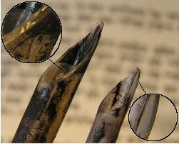
One of the major frustrations of quill-writing, specially for beginners, is when the quill does this:
What causes this?
Well, think about a nib. In the normal way of things, the semiquills line up neatly, the ink channel is exactly the right width, the ink flow is smooth, and so the line produced is nice and even.
When the nib presses onto the page, it lays down the ink. Obviously, the ink channel itself is not doing any laying down of ink, because it is a gap between the two halves of the nib. When the gap is small and the ink abundant, surface tension takes care of that for you, laying down the ink regardless.
Sometimes (insert physics and chemistry here) that means the middle bits of the letters aren't stuck down as firmly as the edge bits, so several decades later, the middle bit is the first to flake off:
That won't happen until after you're dead, though (we plan long-term in this business...). Our present concern is what happens while the ink is still wet.
As we were saying, the ink channel itself is a gap, and when the gap is large enough and the inkflow light enough, writing doesn't happen in the gap. In non-Torah calligraphy, you can have fun with this; you can deliberately cut a notch in your nib, or you can buy scroll nibs for your fountain pen. It's rather a nice effect, really:
More soon...
What causes this?
Well, think about a nib. In the normal way of things, the semiquills line up neatly, the ink channel is exactly the right width, the ink flow is smooth, and so the line produced is nice and even.

When the nib presses onto the page, it lays down the ink. Obviously, the ink channel itself is not doing any laying down of ink, because it is a gap between the two halves of the nib. When the gap is small and the ink abundant, surface tension takes care of that for you, laying down the ink regardless.
Sometimes (insert physics and chemistry here) that means the middle bits of the letters aren't stuck down as firmly as the edge bits, so several decades later, the middle bit is the first to flake off:
That won't happen until after you're dead, though (we plan long-term in this business...). Our present concern is what happens while the ink is still wet.
As we were saying, the ink channel itself is a gap, and when the gap is large enough and the inkflow light enough, writing doesn't happen in the gap. In non-Torah calligraphy, you can have fun with this; you can deliberately cut a notch in your nib, or you can buy scroll nibs for your fountain pen. It's rather a nice effect, really:
More soon...
Friday, November 6, 2009
Quills, part 14
I mentioned that I've been using two quills since August.
Quills are a bit like shoes. If you're going hiking, you want hiking boots. If you're wearing a pretty frock, you want pretty shoes. If you're not going for a particular look, it doesn't matter much.
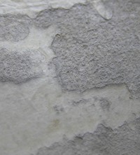 Parchment surfaces vary in texture. Sometimes it can be very very smooth, sometimes rough and sandpapery, and anything in between. The image at right is an extreme example, not from this Torah at all. It's a very close zoom, so you can see the marked difference between rough and smooth.
With quills, if you've got very rough parchment, you want a tough sort of quill. One that isn't going to leap and spatter every time there's a bit of irregularity, one that isn't going to wear out every three minutes so you spend all day sharpening. If you're doing extremely fine, delicate work, you probably want to use something smaller and thinner, because otherwise it's like trying to do ballet in hiking boots. If it's just ordinary sort of parchment, it doesn't matter so much.
 In general, for this Torah, I've been using just an ordinary sort of quill; turkey, not especially remarkable in any way. But occasionally there's been a rougher patch, and for those I've switched to a sturdier quill. Why not use the sturdy one all the time? I just don't feel like it, like I don't wear hiking boots all the time. You can if you want.

Clicky for bigger image
Quills are a bit like shoes. If you're going hiking, you want hiking boots. If you're wearing a pretty frock, you want pretty shoes. If you're not going for a particular look, it doesn't matter much.
Parchment surfaces vary in texture. Sometimes it can be very very smooth, sometimes rough and sandpapery, and anything in between. The image at right is an extreme example, not from this Torah at all. It's a very close zoom, so you can see the marked difference between rough and smooth.With quills, if you've got very rough parchment, you want a tough sort of quill. One that isn't going to leap and spatter every time there's a bit of irregularity, one that isn't going to wear out every three minutes so you spend all day sharpening. If you're doing extremely fine, delicate work, you probably want to use something smaller and thinner, because otherwise it's like trying to do ballet in hiking boots. If it's just ordinary sort of parchment, it doesn't matter so much.
In general, for this Torah, I've been using just an ordinary sort of quill; turkey, not especially remarkable in any way. But occasionally there's been a rougher patch, and for those I've switched to a sturdier quill. Why not use the sturdy one all the time? I just don't feel like it, like I don't wear hiking boots all the time. You can if you want.Between the top and bottom of this next image I switched from regular quill to sturdy quill, and you can't tell where, because I cut both quills to give exactly the same sort of letters. It looks no different, but it made the difference between a fine writing day and a frustrating writing day.
Clicky for bigger image
Thursday, November 5, 2009
Quills, part 13
As we've seen, quills wear down with use, and become less and less useful, whereupon you have to reshape them. Do you remember in Pride and Prejudice when Caroline Bingley says to Mr Darcy "I am afraid you do not like your pen. Let me mend it for you. I mend pens remarkably well"? That's what she's talking about.
Darcy is classy and says "Thank you--but I always mend my own."
Very few people did, it seems. Pens were pretty much disposable.
I have in front of me some figures from the book Western Writing Implements in the Age of the Quill Pen by Michael Finlay. In 1820, the Bank of England bought more than 1.25 million pens, for a staff of 1002 people; that works out to about 300 pens each per quarter. This is on the high end; some businesses only got through about 100 pens each per quarter, but you'd get a new pen-knife every quarter as well.
What do you do with 300 pens per quarter? Well, if you're working a six-day week, that means you're getting through four pens a day. Two hours' writing will wear a fresh quill down to the point where you've either got to sharpen it or stop using it. I've mentioned that learning to sharpen quills is somewhat time-consuming; evidently the clerks at the Bank of England didn't learn to sharpen quills, and when their pens wore down, they'd toss them and take fresh ones.
The dynamics of the quill market have changed rather since then, at least outside of Israel. These days, if you use quills, you really have to know how to sharpen them, and if you want to be any sort of independent you have to know how to make them too. If you're tossing quills at the rate of four a day, you're going to be spending an awful lot of money on quills.
Wednesday, November 4, 2009
Quills, part 12
The thing about shaping the nib is it has to be exactly the same every time. If you get it even a little bit different, verse 2 is going to look different from verse 1, and that's bad news. Oh, it doesn't make the Torah non-kosher, it just looks a bit odd, and you don't want a Torah to look odd.
But nibs are very very little. It's hard to get it exactly the same every time. That's why learning to cut them is a skill. A smidge this way, a smidge that way - crucial.
Anyway, when you get it just right, you start writing with it. All is well for a little while - an hour or two if you're lucky - but all the while, the friction between the parchment and the nib is wearing away your carefully-cut edges, wearing and wearing and wearing, until you notice that your perfect pen is no longer perfect.
So you sigh and sharpen, taking off just enough that the nib is newly crisp at the edges, and not so much that it is noticeably changed in size. That's the idea, anyway.
Every time you sharpen, you necessarily cut bits off, and eventually you'll have snibbled away all the usable part of the quill and have to get a new one (once you've gone up into the pith, you've lost the advantages of a feather, and it becomes basically just a fluffy reed).
If someone is super-expert, they might make a quill last five or six months, even using it every day. While you're learning, you might easily destroy two or three in a day, but once you've got the hang of it you can expect a quill to last you a month or so easily enough. I've been using two since August, and one of them is getting to the end of its life. More about that later.
Tuesday, November 3, 2009
Quills, part 11
For durability, you want a feather that's not too soft, so that you won't be resharpening it every ten minutes. You also want one that's not too flexible; if it is too bendy it will feel more like a paintbrush than a pen, which is sort of annoying - and not too thin, so that you can grip it comfortably. Primary flight feathers are good for quills. Secondaries aren't so bad either, so long as they're big enough. Other feathers tend to be too narrow.
When I'm cutting a quill the first thing I do is chop off most of its length and all of the fluffy bits, so that what remains looks a lot like...a pen. Surprise. Then I soak it in water for ten minutes or so, which makes the next stages easier: chop off the very tip, use a small crochet hook to pull all the crud out from the inside. scrape the membrane off the outside, and roughly shape the end so's it looks like a nib.
Then sometimes I temper it, but not always because I haven't got this down reliably yet, and sometimes it doesn't seem to make a lot of difference. The idea with tempering is to dry the natural moisture out of the feather, so that it will stay sharp longer, by judicious application of heat, chemicals, and/or time.
Then I cut the channel up the middle. The channel is super-clever. It works like the bristles on a paintbrush, to hold a small supply of ink and let it out as needed. If you don't have a channel you can write maybe one or two letters before you have to get more ink. With a channel, you can write at least four or five, and maybe twenty or thirty. People brought up on ballpens and fibre-tips usually think the channel means the nib is broken.
I use a razor blade to cut my channels, but other people swear by knives or by squeezing the feather till it cracks. You do what works for you.
Then I use a scalpel to do the fine-shaping of the nib. A proper proper scribe would use a pen-knife, which they would sharpen periodically. I'm rubbish at sharpening knives, and a knife made of really good steel is expensive, so I use surgical scalpels, which are very sharp for a short time, but aren't designed to stay sharp so I have to keep replacing the blade. I feel a bit bad about this.
Thursday, October 29, 2009
Quills, part 10
Feathers.
Having established that a feather from a kosher bird is not the only permitted tool for writing - reeds, metal and so forth being permitted - the question arises: well, why's it have to be a kosher bird then? The answer, essentially, is "it's just icky to use non-kosher things on Torahs, for heaven's sake."
This makes total sense, except that icky is hard to articulate in the language of halakha. It's not logical, not conveniently legal - but it's a very real visceral reaction which is hard to ignore completely. Thus one gets an interesting division between authorities: one side saying a feather from a non-kosher bird invalidates the writing, and one side saying it doesn't matter in the least what you write with, you can write with a porcupine quill if you feel like it.
Actually I tried making a pen from a porcupine quill, once. Porcupine quills, you may be interested to know, aren't hollow like bird quills, they're full of funny spongy stuff. The spongy stuff is hard to shape and sort of crumbly, but it supports the hard outside. If you scrape away all the spongy stuff, the outside isn't strong enough to write with. If you leave the spongy stuff, it's like writing with a very bad marker.
Porcupine quills: best left as decoration.
Wednesday, October 28, 2009
Quills, part 9
Metal nibs!
Metal pens have a lot of bad press in the sofer's world. Quoting from a Hatam Soferet blog post of a while back, here:
Our aversion to metal implements starts in the Torah, in Exodus 20:22:
Specifically speaking of pens, Jeremiah 17:
Looking forward, to today's sofer. It's not actually per se forbidden to use base metals when making Torah, according to various authoritative sources, but many soferim hold that nonetheless it's utterly inappropriate to use metal tools, and in particular the iron pen, associated by Jeremiah with the numerous times the Jews have failed to play straight by God.
The iron pen carries not only associations of violence but also of disregarding the Torah. It's not necessarily the best tool for the process of creating that selfsame Torah. (Read about the connection with chopsticks here.)
More pragmatically, kosher ink is chemically active, and it plays merry hell with metal nibs. Dissolves them, basically. Also, even metal nibs need sharpening from time to time, and you need a grindstone for that - once you've got the hang of feathers, they're much easier to maintain. And metal nibs aren't as gloriously flexible as quills, either - so metal nibs lose on pragmatic and homiletic grounds.
Metal pens have a lot of bad press in the sofer's world. Quoting from a Hatam Soferet blog post of a while back, here:
Our aversion to metal implements starts in the Torah, in Exodus 20:22:
If you build an altar of stones to me, you shall not use dressed stone; if you lift your sword to it you pollute it.And in 1 Kings 6:7:
In building the House, stones ready-dressed were brought, so that neither hammer nor axe nor any iron tool was heard in the House during its construction.Rashi, the most widely-accepted biblical commentator, explains:
The altar was made to lengthen man's days, and iron was made to shorten man's days; it isn't appropriate to lift something which shortens against something which lengthens. Also, the altar brings peace between Israel and their heavenly father, so one should not use upon it anything which cuts and destroys.
Specifically speaking of pens, Jeremiah 17:
Judah's guilt is written with an iron pen...Judah here means the Jews; Jeremiah is talking about how the Jews have messed up again, so it seems likely that Jeremiah didn't choose an iron pen just because of its material properties - he chose it because spiritually iron has nasty overtones. A set of sinister connotations, if you will.
Looking forward, to today's sofer. It's not actually per se forbidden to use base metals when making Torah, according to various authoritative sources, but many soferim hold that nonetheless it's utterly inappropriate to use metal tools, and in particular the iron pen, associated by Jeremiah with the numerous times the Jews have failed to play straight by God.
The iron pen carries not only associations of violence but also of disregarding the Torah. It's not necessarily the best tool for the process of creating that selfsame Torah. (Read about the connection with chopsticks here.)
More pragmatically, kosher ink is chemically active, and it plays merry hell with metal nibs. Dissolves them, basically. Also, even metal nibs need sharpening from time to time, and you need a grindstone for that - once you've got the hang of feathers, they're much easier to maintain. And metal nibs aren't as gloriously flexible as quills, either - so metal nibs lose on pragmatic and homiletic grounds.
Tuesday, October 27, 2009
Quills, part 8
If you don't use a quill for a few days, it will usually dry out a bit and lose its shape. Recutting it is a bit of a pain. If you're then going to be using it all day, that's time well spent, but if you're just going to fix a letter or two in a broken Torah, a plastic nib is totally the way to go, since it keeps its shape between uses. You can just keep it in your pencil case and there it is, ready to use.
A plastic nib is also a good tool for learning, in a way, since it means you can practice when your teacher isn't there. (I was never taught to tune my violin, which was one reason I didn't do a lot of violin practice - the other reason was being undisciplined...same problem...good thing I'm a decent calligrapher, because I'm a terrible violinist.) But you'll still need to sharpen it eventually, or else spend a lot of money on nibs, and you're better off learning sharpening on a real quill, it's much easier. Also a plastic nib won't make very fine lines, and you need to know how to do those eventually.
A crude method of letter formation uses a plastic nib to get the body of the letter in place, and then comes along later with a gel pen and puts in the very fine lines. This is all very well, but it is sort of like learning to sing and stopping at karaoke - there's so much more to it than that.
Monday, October 26, 2009
Quills, part 7
Fibre-tips and plastics
The thing with fibre-tips is that they don't contain the special kosher ink.
Now, this isn't necessarily the end of the world, because there are two schools of thought re ink. One says that kosher ink has to be black and stay black, and the other says that this blackness has to be attained by means of the traditional ingredients (read about that here).
The former school of thought will be satisfied with archival-quality black inks, which are designed to stay black for serious amounts of time. They're also made with entirely synthetic ingredients, which means you can be sure there aren't any non-kosher ickies in there. So, a member of the former school can use fibre-tips just fine.
The only problem then is that when they wear down, they're jolly difficult to sharpen. You can use a scalpel to sharpen up a marker, but you still don't get much mileage out of it. A $3 marker might last you a day or two, where a $0.50 quill will last you a month; that means markers are only really worth it in situations where quills are tricky (like very small mezuzot) or perilous (intricate repair jobs).
Plastics are one of my favourite modern refinements to the scribe's craft.
Once I was doing a Hebrew school visit, the sort where I hand round quills and things for the children to look at, and one of the children asked me if the quill was made of plastic. As it happened, it was a real feather quill, but this child had done something interesting - noted the material properties of the quill in her hand, and observed that they matched the material properties of plastics with which she was familiar.
Some smart sofer did the same thing, and came up with plastic nibs for scribes - pre-cut quills, essentially; you pop them onto the end of a feather or a pencil, and you're good to go. One buys them in Israel, or if in the USA from talasonline.com. You still have to sharpen them from time to time, but they're not at all bad, and very convenient.
And in an emergency, you can cut a quill from a drinking straw. Been there, done that :)
Sunday, October 25, 2009
Quills, part 6
Reeds.
Reeds have been a traditional Sephardi thing, and have contributed to the distinctive Sephardi script.
In a nutshell, a reed tends to give less contrast between thick and thin lines than a feather, and reed writing tends to show less contrast between thick and thin lines than feather writing. Compare the images below: the first is characteristically Sephardi reed-influenced script, and the second characteristically Ashkenazi and feather-influenced.
Speaking in general terms, Ashkenazi Jews tended to be in parts of Europe where quills were widely used, and Ashkenazi scripts often make heavy use of techniques and flourishes which rely on having a very flexible, very thin, very sharp writing instrument such as a quill, and trying to write that way with a reed will cause you much heartache. Sephardi Jews, on the other hand, tended to be in parts of the world where reeds were the writing instrument. A reed won't take an edge the same way a quill does, so it can't make those hair-thin vertical lines beloved of Ashkenazim, and it isn't as flexible, so the shapes are bolder and starker. This also makes Sephardi scripts quite a lot quicker to write, incidentally, which is why they are sometimes considerably cheaper to purchase.
A calligraphy marker resembles a reed a lot more than it resembles a quill, so trying to learn an Ashkenazi sta"m* alef-bet with a calligraphy marker will give you limited success. That's why my worksheets for beginners use markers but concentrate on skills, and don't go all the way to showing you how to make the fine details - it just won't really work. The logical thing would be for me to teach Sephardi script with calligraphy markers, but so few of my students are Sephardi that it doesn't make much sense really.
Here's a couple of rules from the scribal rule book of the Hida (Hayim Yosef David Azulai, late 18th century, Mediterranean regions), Torat Ha-Shelamim (chapter 18)
8. The quill should be made from a reed, not from a feather.
9. When the quill is ready for writing, he should put its tip in his mouth and roll it around in his spit (rir). He should say: Just as this spit is pure before it leaves the mouth, so shall this quill be pure when I write the holy Torah with it. This is because rir has the same numerical value as kadosh (holy) [210].
I don't write with reeds, myself, but I'd guess they're more flexible - easier to write with - if you soak them a bit before use, hence this custom. More of the Hida's rules here; more on quills shortly.
* sta"m - abbreviation for "sifrei Torah, tefillin, mezuzot."
Thursday, October 22, 2009
Quills, part 5
Concerning interaction with one's fellows, Rabbi Elazar taught: one should be soft like a reed rather than stiff like a cedar, and it is for this reason the reed merited to be used in the writing of sifrei Torah, tefillin, and mezuzot. (Taanit, 20b)
In Rabbi Elazar's time, reeds were what people made pens from.Indeed, the rabbinic word for a quill, kulmus, comes from the Greek word for a reed, calamus. Feathers didn't come to be used for pens until about 700CE, in Europe.
Popular lore has it that one may only use a quill from a kosher bird to write Torah, but we see at once that if you can use a reed, clearly kosher feathers aren't the only permitted tool. Modern alternatives include metal, plastic, and fibre-tipped pens, as well as feathers and reeds. More about those coming up.
Wednesday, October 21, 2009
Quills, part 4
Quill cutting list. Okay, this isn't very interesting to most Torat Imeinu readers, but maybe it's a bit interesting to some readers.
Razor blades and pocket mirrors you can get in a pharmacy. Feathers you can pick up from the ground if you're lucky, or buy in craft shops.
Surgical scalpels are less conveniently found - you can buy them on ebay, and I also stock them in my Etsy shop.
Once I've found something in which to ship ink, I'll be putting that up on Etsy too. But check out talasonline.com; they have kosher ink (stocked as Yemen Ink) and kosher parchment (stocked as Israeli parchment). They're expensive, but convenient.
Also recommended: paperinkarts.com:
under Quills & Quill Knives:
--Feathers - RAWQUL- you can buy cured ones if you like; you're going to spoil a lot of them while you're learning, so it's not necessarily worth it. Get five or so.
under Cutting Tools
--scalpel handle - SCALPL - metal handle and two #10 blades.
--spare blades - 5#10BL - five spare #10 blades.
- feathers
- or other hollow tubes
- sharp knife
- I use surgical scalpels, because they are SHARP, and this is good for accuracy. Craft knives also work well for rough shaping.
- razor blade
- Did you know you can buy them in packets? I didn't. As far as I'm concerned razors come in a packet labelled Bic Ladyshave - but if you go to the Men's Shaving section, whaddya know, razor blades.
- piece of tile
- or glass, metal, perspex - something to cut down onto. I like tile; a pocket mirror also works and you can also use it to check that your tefillin are on straight.
- Ink and klaf for testing
- Test with the materials you will actually be using. A quill that works nicely on parchment may work horribly on paper, so if you're testing on paper it'll look dodgy and then you'll be slaving away trying to fix something that isn't broken.
Razor blades and pocket mirrors you can get in a pharmacy. Feathers you can pick up from the ground if you're lucky, or buy in craft shops.
Surgical scalpels are less conveniently found - you can buy them on ebay, and I also stock them in my Etsy shop.
Once I've found something in which to ship ink, I'll be putting that up on Etsy too. But check out talasonline.com; they have kosher ink (stocked as Yemen Ink) and kosher parchment (stocked as Israeli parchment). They're expensive, but convenient.
Also recommended: paperinkarts.com:
under Quills & Quill Knives:
--Feathers - RAWQUL- you can buy cured ones if you like; you're going to spoil a lot of them while you're learning, so it's not necessarily worth it. Get five or so.
under Cutting Tools
--scalpel handle - SCALPL - metal handle and two #10 blades.
--spare blades - 5#10BL - five spare #10 blades.
Tuesday, October 20, 2009
Quills, part 3
Learning to cut and shape quills is one of the most stumbly stumbling-blocks a newbie scribe has to negotiate.
I learned to cut quills from a combination of websites (regia.org, liralen, and the ever-helpful Mordechai Pinchas), assistance in person, and practice.
When you're starting out, you don't know what a good quill is supposed to feel like, so you don't know if you're doing it right or not. Assistance in person is especially useful at this point.
When I was learning, Mordechai Pinchas was kind enough to send me a couple of ready-cut quills. It really helps. (Also especially worth noting is his tip about the Sharp Click - read his instructions; where he says A loud "click" confirms a good sharp cut and thus a clean edge, pay extra attention.)
Mediaeval re-enactment sites are jolly good for telling you how to recreate the mediaeval way of doing things, but they aren't very useful for incorporating modern technology. Fair enough, obviously, but one thing it took me a long time to learn was: a razor blade is the best tool for cutting the ink channel. I was shown that particular trick by the sofer at Pardes, and life got easier.
But practice is the main thing. If you're a beginner, it's quite normal to spend all morning wrestling with your quill. If you're a beginner whose teacher is nearby, they can sort you out; if you're not that lucky, you just have to keep working at it. When I started my first Torah, I could get a decent quill eventually, although it might take me an hour or more; by the end of that year, I could get a decent quill pretty much every time. Practice.
Monday, October 19, 2009
Quills, part 2
An historical interlude.
Pitted against a metal nib, a quill almost always loses - strength, durability, convenience, level of skill required in user - metal nibs win. Metal pens have been around for an extraordinarily long time, since I think about 1000CE, but quills remained the writing instrument of choice for Europeans well into the nineteenth century, because they were so easily obtained and made.
Businesses bought quills by the thousand for their clerks, and professional quill-cutters were commonplace (a professional quill-cutter might reasonably be expected to produce between six and eight hundred pens per day). Metal nibs only took off with the advent of the steam-engine, mechanising the process so that mass-production of metal nibs became faster and cheaper than cutting feathers. It also took some time to develop a suitable alloy, one that was both flexible and durable. Once this was done, metal nibs quickly became ubiquitous, and the profession of quill-cutter obsolete.
Most pens, quill or otherwise, are shaped such that the barrel of the pen stays whole where the fingers grip it, but then is cut away and shaped into a nib (below, top). Torah scribes leave their nibs broad (below, bottom picture, left nib), so that they can make broad lines, but they may be larger or smaller, and for very fine writing the nib may be cut to a sharp point. As the pen is used, the corners tend to wear away (bottom picture, right nib) and the scribe will have to restore the shape every so often. Later on, we'll see that that can mean several times a day, so metal nibs are a good deal more convenient, for the most part.
However, a quill remains the tool of choice for top-flight calligraphers (har har), because it is capable of much more subtlety than any metal nib, more on that later. Soferim also have other issues with metal nibs; more on that later.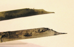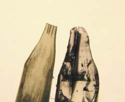
(You noticed, of course, that the left nib in the bottom picture has three ink channels instead of one. That's a modification one makes in certain circumstances, mostly in repair work when you are re-inking crumbling letters; you want a lot of ink and a lot of flexibility.)
Sunday, October 18, 2009
Quills, part 1
I sat down to write a post on quills, and before I knew it I had fifteen posts and was still going strong. I never knew I could say so much about quills. So we're going to have Quill Month. Tenuous link: it's parshat Noach, and that's got birds in it, and birds have feathers, which is what we make quills out of...see? Tenuous.
Okay, quill terminology.
Quill: the tubey middle bit of a feather, the pen made from same.
Nib: the business part of a quill. Note that the nib has a slit up its centre. The slit divides the nib into semiquills*. The slit forms a channel in which ink lives (as you can see in the picture), so sometimes I call it an ink channel. The ink sits in the channel and gets pulled out gradually, as the nib sets ink onto the page - like a candle wick, but in reverse (physics is so clever).
The nib is cut from the non-fluffy end of the feather.
Many people, myself definitely included, strip off the fluffy bits before working, so that the quill resembles a pen more than it does a feather. This is because when you are working (rather than playing about), the fluffy bits get in the way and are just annoying.
The quills in the top picture are goose. The quill in the bottom picture is turkey. Goose is good for smaller work, like mezuzot; turkey tends to be sturdier and more durable, so I like using it for Torah work.
Some scribes temper their quills with heat or chemicals. The idea is for the tempering process to harden the feather, and then it stays sharp longer and is nicer to write with.
Tempering can be tricky - the problem is that if you don't do it enough, nothing happens, but if you do it too much, you melt the quill. If you melt it, tiny air bubbles form and are trapped in it when it hardens so you can't cut it to a smooth edge, plus it's far too brittle to be useful. I do it sometimes, and sometimes I don't bother.
Okay, quill terminology.
Quill: the tubey middle bit of a feather, the pen made from same.

Nib: the business part of a quill. Note that the nib has a slit up its centre. The slit divides the nib into semiquills*. The slit forms a channel in which ink lives (as you can see in the picture), so sometimes I call it an ink channel. The ink sits in the channel and gets pulled out gradually, as the nib sets ink onto the page - like a candle wick, but in reverse (physics is so clever).

The nib is cut from the non-fluffy end of the feather.
Many people, myself definitely included, strip off the fluffy bits before working, so that the quill resembles a pen more than it does a feather. This is because when you are working (rather than playing about), the fluffy bits get in the way and are just annoying.
The quills in the top picture are goose. The quill in the bottom picture is turkey. Goose is good for smaller work, like mezuzot; turkey tends to be sturdier and more durable, so I like using it for Torah work.
Some scribes temper their quills with heat or chemicals. The idea is for the tempering process to harden the feather, and then it stays sharp longer and is nicer to write with.
Tempering can be tricky - the problem is that if you don't do it enough, nothing happens, but if you do it too much, you melt the quill. If you melt it, tiny air bubbles form and are trapped in it when it hardens so you can't cut it to a smooth edge, plus it's far too brittle to be useful. I do it sometimes, and sometimes I don't bother.
* Okay, the proper word is "tines," but "semiquills" is a much prettier word. Credit to my chum Gabriel for inventing a good word.
Tuesday, October 13, 2009
Today...
When writing Torah, the sofer is supposed to speak each word before writing it.* The speech somehow causes the essence of the words to waft through the air in holy, mystical fashion and settle onto the parchment, to be followed in short order by the letters themselves. Like spreading rose petals before a bride, if you will.
Today I was writing down at Yeshivat Hadar. I like writing Torah in places of Torah in general, but today it so happened that while I was writing, the group was listening to Rabbi Held talking.
It's always worth listening to Rabbi Held talking (PLUG FOR OCTOBER 21 EVENT), he's the sort of person you ought to want to be when you grow up, but today in particular - I was listening with a quarter of an ear because I was mostly concentrating on writing Torah - he was talking about making your Torah study lead to being a better person. How learning Torah ought to be allied with becoming a better, kinder, more present person. About how all of Torah is fundamentally a set of pointers towards getting more chesed - loving-kindness - into the world. How chesed is and can be all-pervading and enough.
Mix that in with the image of the sofer's articulated words settling onto the parchment. This afternoon I think all that chesed in the air must have settled onto the parchment as well, how could it not have? Layers and layers of chesed, and then the breathed words, and then the written words.
I thought it was a nice image.***
* Keset ha-Sofer 4:6
** Except richer and better, but I was only listening with a quarter of an ear, so I can't give more details, sorry; go hear R' Held if you get the chance
*** I was writing the bit about the Sin of the Golden Calf at the time. You tell me how that plays out!
Friday, October 9, 2009
God said...
With the book of Exodus start God's communications with Moses.
The phrase ויאמר ה' אל משה comes up 67 times in Torah - and my goodness it feels like more than that - 42 in Exodus, 2 in Leviticus, 21 in Numbers, and 2 in Deuteronomy.
וידבר ה' אל משה comes up 91 times - 14 in Exodus, 33 in Leviticus, 43 in Numbers, but only once in Deuteronomy.
Deuteronomy has its own phrasing idiosyncracies. We'll hear more about them when we get there.
Sunday, October 4, 2009
ears and mouths
The other week, in Exodus 13, I wrote the verse
והיה לך לאות על ידך ולזכרון בין עיניך למען תהיה תורת יקוק בפיך
It shall be a sign upon your hand and a remembrance between your eyes, in order that God's Torah shall be in your mouth...
This is the verse whence we derive that the Torah is to be written only with materials from kosher species (more about that here).
A few chapters later, in Exodus 17, God says to Moses:
ויאמר יקוק אל משה כתב זאת זכרון בספר ושים באזני יהושע
...Write this for a remembrance in a book, and put it in the ears of Joshua...
and one wonders what the Torah would look like had we chosen to take this verse literally as well.
Saturday, September 26, 2009
Stage management
Sukkah-building. Ink in foreground.
The Soferet likes a bit of human interaction now and again, and so on Thursday I was working in the library of the Jewish Theological Seminary here in New York.
There's a bit of the library which is set up as a beit midrash, with Talmud volumes instead of the usual academic books. It's got great big windows, and most of the time it's very quiet. (The real beit midrash is elsewhere, you see. Underground, so the light isn't as good. But with free tea. I might work there next week.)
A young woman passed by and did a double-take: quill and ink? what is that happening there? crikey, it looks like Torah... and we ended up having a nice conversation, in which she mentioned that she'd never before seen a Torah in the process of being written, and indeed had never really thought about how the Torah gets to be the way it is.
A soferet's job is like that. You work in the background, doing your job, and when it's done, all attention is on your product, the shiny new Torah, and perhaps you deliver it and interact with the community and perhaps not, but in any case afterwards you fade back out and the Torah takes over.
Personally, I don't mind this - I also enjoyed stage-managing in college - but what grabbed me particularly was that outside the lovely big windows, the JTS ground staff were building a sukkah, ready for the Sem to use next week. Next week perhaps the students will have sukkah-decorating and perhaps they won't, but the actual building of the sukkah took place, like much Torah-writing, in the background, so that next week the sukkah will be ready for use and the ground staff will have faded into the background.
So, that was a nice parallel, last Thursday. Me inside, writing Torah more or less unseen, and them outside, building a sukkah more or less unseen, setting the stage for the pageantry of Sukkot and Simchat Torah, upon which the curtains will open next week.
Friday, September 18, 2009
Half a vort
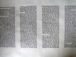 The text of the Torah is written out in columns, as I expect you know. Our Torah will have 245 columns*.
As it happens, 245 is also the number of words in the Shema (full text here). Good parallel, eh? The Shema is the cornerstone of the liturgy; the Torah is the cornerstone of the religion. The Shema says, bring God into all your doings; the Torah is the guide as to how. The Shema declares faith in God; the Torah symbolises God's presence. 245 words; 245 columns.
We could leave it there, and that would be very nice. However, the Shema in liturgy has an interesting peculiarity, thus: when praying as individuals, we precede it with the three words אל מלך נאמן, God truthful King. When as a community, three words are added after its silent recitation - the last two words ה' אלהיכם the-Lord your-God are repeated aloud, and the word אמת, emet, true added.
Why's this?
Well, 245+3=248, and 248 in the rabbinic narrative corresponds to the number of pertinent parts of the human body. Proverbs 3 says of the Law It shall be health to thy navel, and marrow to thy bones; how better to map the fundamentals of the Law onto the fundamentals of the body than by reference to the Shema? One word for each body part, says Rav Nehori,** and everything will be good above and below.
248 is also the number of positive commandments in the Torah, as it happens. 248 imperatives, 248 vital body parts, and 248 words in the vital liturgical element.
245 columns in the Torah seemed jolly nice a few paragraphs ago, but now it seems we've got three bits missing.
Well, the Torah lives on a pair of rollers. Some call them spindles, some call them atzei hayim, trees of life - and some call them amudim, columns.
Recall that the three words added to the 245 in the Shema are אל מלך נאמן, God truthful King or ה' אלהיכם אמת the-Lord your-God [is] true. Both times, it's two words and emet, truth. With our Torah, we've got 245 columns of words, 2 wooden columns, and...and something.
What is it, this final something?
Our clue comes from another "column," the amud, the desk from which the Torah is read. Torah reading is, after all, the link between the scroll and the life of the community, both now and in all the generations before. The Torah does not mean much if it is not part of people. The Shema is only 247 mumbled words without the emet. The 248 body parts aren't much without the spark of life.
There are several ways I could finish this off, and you don't need me to say any of them, because they're all going to sound crass and didactic compared to what you can think of yourselves. So the Torah - it's 247 columns, and you.
* Not all Torahs have 245 columns. Column height and width can vary, and therefore so can the total number of columns. People are often surprised to learn this.
** Midrash Ne-elam (Zohar Chadash to Ruth), via the Mishnah Berurah on this aspect of Kriat Shema (61:6), see also Virtual Beit Midrash.
Saturday, September 12, 2009
Ambiguous letters quiz
Here's a link to the laws of forming the letters. Now:
 Reish or dalet?
 Middle letter: khaf or beit? Kvar or kikar?
Reish or dalet?Middle letter: khaf or beit? Kvar or kikar?I really wanted to make this a proper poll with clicky buttons, but I couldn't figure out how to get the images and the clicky buttons into the same entry, and I wasn't going to spend all night trying to make it work (if someone tells me how, I'll edit the entry).
Thursday, August 27, 2009
Ink!
 The main thing about Torah ink is that it has to be black and it has to stay black. If it changes colour within fifty years, it wasn't kosher to begin with.
Generally, Torah ink (דיו, in Hebrew, like dye) is what's called an iron gall ink. Iron gall inks have been used in a great many places during a great many periods in history. They last a long, long time (think Dead Sea Scrolls kind of longevity). They have an unusual property among pigments in that they form chemical bonds with the parchment, which makes them symbolically very appropriate for use on Torahs. They are lightfast, the ingredients are cheap, and they are very indelible.
I don't make my own; making good ink is hard, and I don't have anyone willing to share their recipe. Anyway, it's supposedly rather a pain, so I buy it in bottles, as shown. I don't know if it's also available in cake form - cake is much easier to transport, of course, and lasts longer, and is entirely traditional. I suspect perhaps not, because I have a feeling that buying ink like this is kind of For Dummies, and real hardcorers, the kind who would want cake ink, probably do make their own.
As you might expect, there are hundreds of different recipes for this kind of ink. However, they have some things in common, viz.: gallnuts, iron (II) in solution, something runny, and something sticky. The following descriptions are indebted to an excellent article by Cyntia Karnes.
 Gall nuts
See the Wikipedia entry, but basically gallnuts (also called oak-apples) are a sort of arboreal tumour. A gall wasp comes along and lays its egg on the tree, and the tree goes "whoa" and swells up around the egg, into this little hard ball. The larva sits inside the swelling, munching away, and when it grows up it eats its way out and leaves the ball on the tree.
The balls have to be turned into a gloopy solution. This basically involves grinding, dissolving, and fermenting, and there are about a zillion ways of accomplishing this. Depending how it's done, what you end up with is a liquid containing tannic acid, gallotannic acid, or gallic acid.
 Iron (II) sulphate
This is where the iron comes from. It tends to be known as copperas, or coppervasser if you are the Mishnah Berurah, because iron sulphate and copper sulphate tended to come out of the ground together, but the copper isn't important and the iron is.
 This is why some recipes call for boiling up nails with the gallnuts. In an acidic solution, you get the right sorts of reactions. It's apparently quite dangerous if you do it properly.
 Runny and sticky
Fairly obviously, ink needs to be runny, but it also needs to stick to the page. Gum arabic, the sap of certain sorts of acacia tree, dried, ground, and dissolved in water, is commonly used as a binder in all sorts of things - ink, paint, food - and has been for centuries. It stops the ink being too runny, and helps stick it to the parchment when it dries.
 Runny can be distilled water, but it can also be wine (including idolatrous wine, isn't that interesting?) or vinegar, or presumably most other sorts of liquids. Vinegar helps to make the ink shiny, I am told (the gum arabic goes on shiny, and the vinegar helps keep it shiny, something like that), and indeed one of the shiniest brands of ink out there smells very vinegary indeed.
Chemistry
This is the fun bit. You mix all these things up, apply them to parchment, and let the oxygen in the air do its thing. It's incredibly complicated and I don't understand it all, but basically what goes on is: the gallotannic acid bit reacts with the parchment; part of it grabs onto the parchment, and part of it floats about. The floaty bit reacts with that iron solution, and iron (II) oxide gets precipitated. Iron (II) oxide is black.
Iron-gall ink made like this is pale grey in colour, and it gets darker when these reactions have had time to happen - about a day, I understand, but I've not tried it.
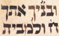 Incidentally, iron (II) oxide isn't terribly stable, and over time it tends to turn into iron (III) oxide. This is the same stuff rust is made of, and it's red. This is why letters in old Torahs go brown or orangey-red, as the black iron (II) compound oxidises to the red iron (III) one. They're just starting to go brown in the picture here.
Soot
For whatever reason, the inks I buy have had stuff added to them so that they are black when they go on, and presumably they get blacker with oxygen, but not so's you notice. I think this is soot - burnt olive oil is referenced in one source, or just burnt wood. They say specifically you mayn't use burnt ivory (ivory-black), since elephants aren't kosher.
 Non-iron-gall inks
The rule is that the ink has to be black and permanent, and for the longest time the way to make permanent black ink that would work on a scroll (wouldn't fall off when rolled) was like this. However, these days we have all manner of funky synthetic blacks that are entirely lightfast and suitably adherent and flexible. Can we use those?
The discussion then takes one of two approaches.
a) The sources talk about using the ingredients for iron-gall ink, so this must be part of what kosher ink is, and to use kosher ink is a requirement from Sinai.
b) That is by way of description, it's true that in those days they couldn't make good ink without iron galls etc. But the point is that the ink be indelible and black; synthetics accomplish this just as well, and there are times when they're a better tool, in some ways.
Interestingly, the right of the denominational spectrum seem to be more okay with b) than the left. The left-tending and the ultra-right frequently share a visceral aversion to b) and insist on a) only. Happily, it's not really an issue with brand-new Torahs, where you don't need synthetics for anything.
To finish, here's the Keset ha-Sofer, the scribes' handbook, on basic laws pertaining to ink.
Subscribe to:
Posts (Atom)

